Lesen Sie den Artikel
Lesezeit: 7 Minuten
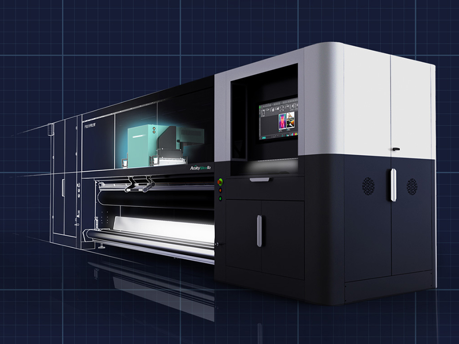
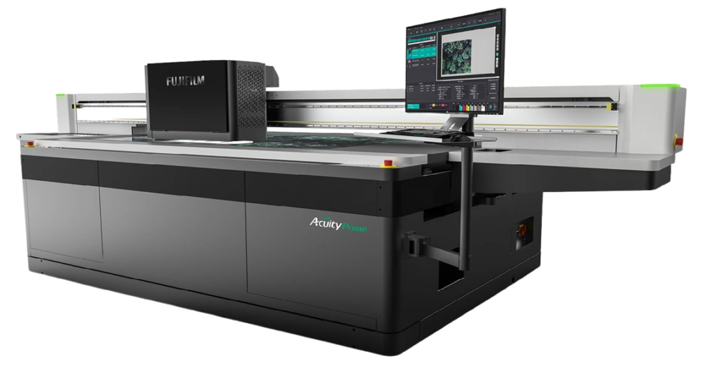
Following the announcement that Fujifilm’s new wide format printers, the Acuity Prime and Acuity Ultra R2, have won Red Dot Awards for product design, Fujifilm’s Kevin Jenner asks: What does good product design really mean? Beyond a stylish exterior, he argues, it’s about usability, reliability and value. Why would a tradesman buy a Mercedes Sprinter van and fill it with Makita tools? There are cheaper vans and there are cheaper tools, but in those brands he’s buying into a perception of quality and reliability that is going to enhance the work that he does and boost his business.
The cynic might say that brand perception is down to good marketing – and they may well be partly right – but brands that stand the test of time, brands that people have confidence in and keep returning to, time and again, have a lot more than clever marketing behind them. They have outstanding product design.
In our own industry, businesses make important, and often very capital-intensive, buying decisions all the time. Machines reach end of life and need to be replaced, and business owners weigh up what their customers want against what is needed to deliver it, and then they make a choice. Cost is a major consideration in these decisions, of course, but more than that, people are asking “what can it do, how well can it do it, and how easy is it to work with?”

If a CapEx investment can expand the customer offering, boost productivity, cut waste, save time and reduce hassle – that’s good design on the part of the manufacturer, and a solid investment for the customer. But how do we get there? How do we create extraordinary design that can transform a business by making work more efficient, more enjoyable, more productive and ultimately boost ROI?
“The broader one’s understanding of the human experience, the better design we will have.” That’s Steve Jobs again. Good design starts with understanding. By seeking to understand everything, from the long-term business goals, to the day-to-day frustrations of the customers we serve – we give ourselves the best starting point for good product design.
So for this project we needed a deep understanding of our customers’ needs and time to have meaningful conversations with them. This wasn’t a box-ticking survey sent out by email, this was our designers (a specialist industrial design agency, Realise Design, appointed to support the Tokyo Design Team) shadowing our customers as they worked, looking for a thousand small ways to optimise their experiences and their businesses.

We looked at how improved product design could lead to improved usability, to enhanced performance and to better ROI. I’m going to quote Steve Jobs once more (last time, I promise!) as I begin to wrap this up.

Simple can be harder than complex. You have to work hard to get your thinking clean to make it simple.
Steve Jobs | Formerly Apple
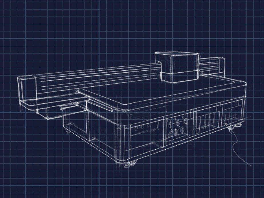
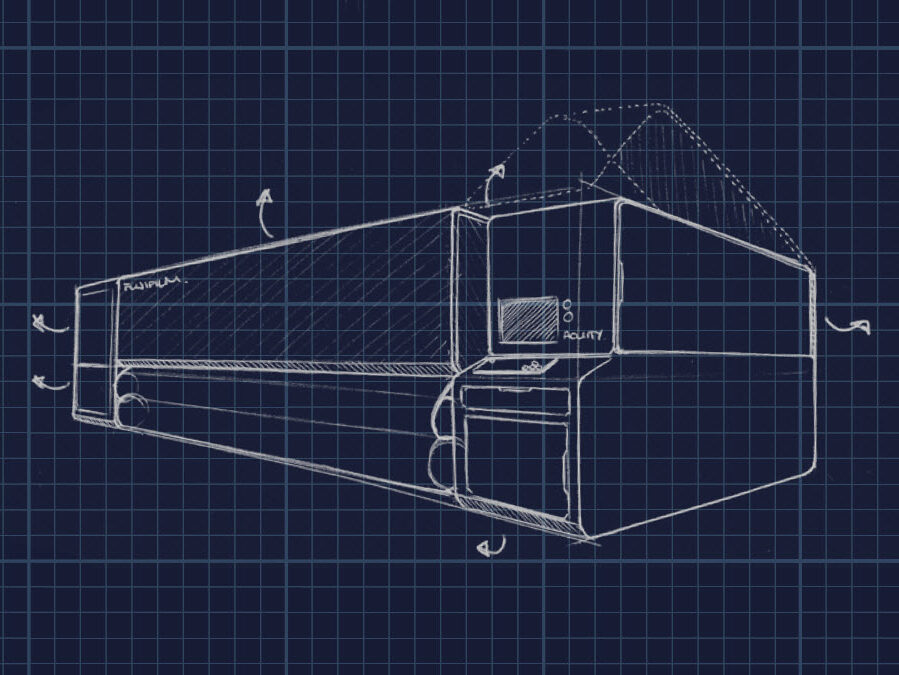
Products which are developments to a design first conceived a decade ago sometimes need a complete rethink, in effect going ‘back to the drawing board’. But not at all in the sense that the old is completely discarded, more in the sense that everything is scrutinised and nothing stays as it is simply because ‘that’s the way it’s always been’.
With this project, we gave ourselves the freedom to go right back to first principles, and that led us to create something quite different to anything either we – or anyone else – had created before. This is the reason that when we first revealed the new machines in June 2021, we called them ‘the new blueprint for wide format’.

As with any product, the default is always to adapt what is there already, and products which have been tinkered with, tweaked and adapted over the years can often develop layers of complexity which are detrimental to performance, but we’re so used to them being there, it can be difficult to comprehend it being any other way.
Clever marketing? We’d like to think so, yes! But it’s a lot more than that. These products are designed to be a joy to work with; products designed for maximum productivity and versatility; products designed to be affordable. And that last point is important, the sleekest look and the highest level of performance is of no real value if it’s unaffordable to the people it’s designed for. A crucial part of good design in any commercial context is stripping out unnecessary costs while ensuring no compromise on what it needs to do well.
That was another critical part of the process we went through – we sought out the best component parts and the most suitable manufacturing partners to deliver on quality, performance and value. The end result, in our case, is a new range designed to redefine the price/performance ratio, deliver unrivalled levels of versatility and value and to boost ROI.
And we made sure they looked great too!

Learn more about the Acuity range
Entdecke mehrVielen Dank für Ihre Anfrage, jemand wird sich in Kürze mit Ihnen in Verbindung setzen.